How Tailwind CSS reduced my frontend development time
January 15, 2019Tailwind CSS has reduced my style-development time to half. It’s amazing and something that you should try!
Tailwind CSS is a utility first CSS framework that enables rapid CSS development — it’s basically a set of CSS classes that we can apply on HTML tags to get results and try things quickly. I am sure you have used bootstrap at some point of time and you know for responsiveness, bootstrap has classes like row, col and col-lg-2. Apply and forget.
<div class="container"> <div class="row justify-content-md-center"> <div class="col col-lg-2"> 1 of 3 </div> <div class="col-md-auto"> Variable width content </div> <div class="col col-lg-2"> 3 of 3 </div> </div></div>Classes like row, col are utility classes.
We don't have to write dedicated CCS classes for grid functionality. Similarly, tailwind CSS provides a comprehensive suite of CSS classes for everything from flexbox to font properties like font-weight and font-decoration. just as we did in the above example, we can compose required CSS classes to achieve the required functionality.
See the following HTML code and output:
 The output of following code snippet
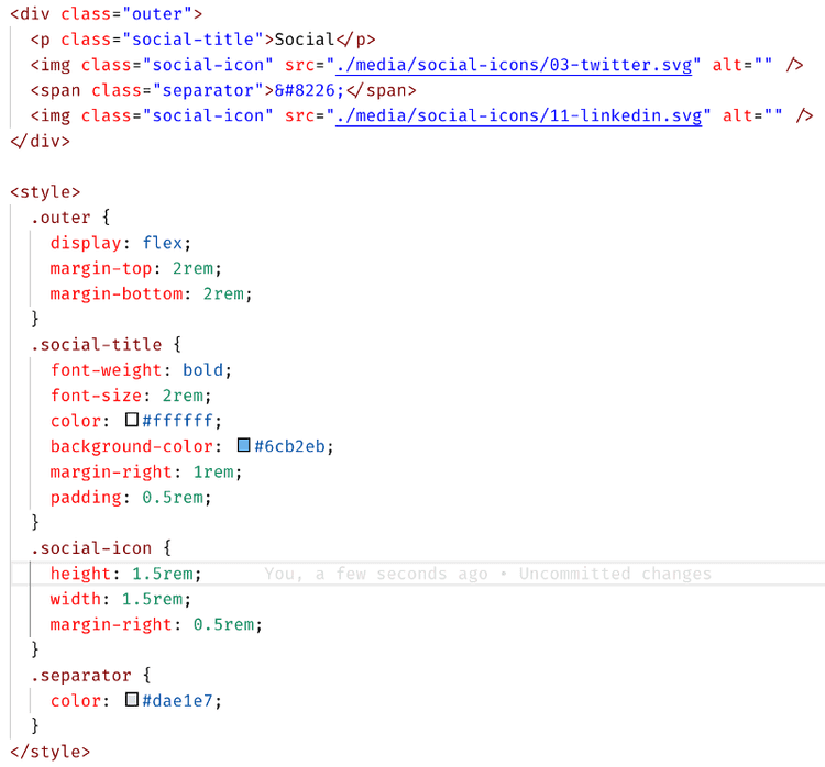
 Ordinary HTML and CSS code
In Ordinary HTML/CSS:
- First, you have to write HTML and invent some class names and hierarchy. Many times, they clash with existing names.
- In the possibly separate CSS file, define those classes. Frequent file switch.
- Even to try out things, we have to do the above steps — who knows when it will look perfect and we can just leave it there?
- You have to write lengthy CSS properties yourself like “background-color: blue;”. This slows down things.
- Unless you are using CSS or SASS variables, you might end up in having a mixture of all sort of colors and sizes.
Now with Tailwind CSS,
 Code with Tailwind CSS utility classes
- You need to write HTML and quickly apply utility CSS classes as you go.
- No separate CSS file to fiddle with and look up frequently.
- Try out things rapidly — without bothering of separate dedicated CSS classes. Should this div be a blue-border? Just add border-blue and forget.
- Shorter code like bg-blue instead of background-color: blue;
- Utility classes for your colors, sizes are predefined (more on this later) and fixed. Everybody used those classes — this ensures a common standard.
All this combined gives us a rapid UI Style development toolkit that enables excellent DX (Developer experience).
You can customize tailwind classes for your design system.
First, you have to write a tailwind configuration file. You can add all type of things like font sizes and rounded borders. It looks like this:
let colors = {

black: "#22292f",

"grey-darker": "#606f7b",

grey: "#b8c2cc",

"grey-light": "#dae1e7",

white: "#ffffff",

beige: "#f8f8f8",

"red-light": "#ef5753",

"green-light": "#51d88a",

blue: "#3490DC",

"blue-light": "#6CB2EB",

"blue-dark": "#34495e"

};

width: {

auto: "auto",

px: "1px",

"1": "0.25rem",

"2": "0.5rem",

"3": "0.75rem",

"4": "1rem",

"5": "1.25rem",

"6": "1.5rem",

"8": "2rem"

}
// and many, many more things like these
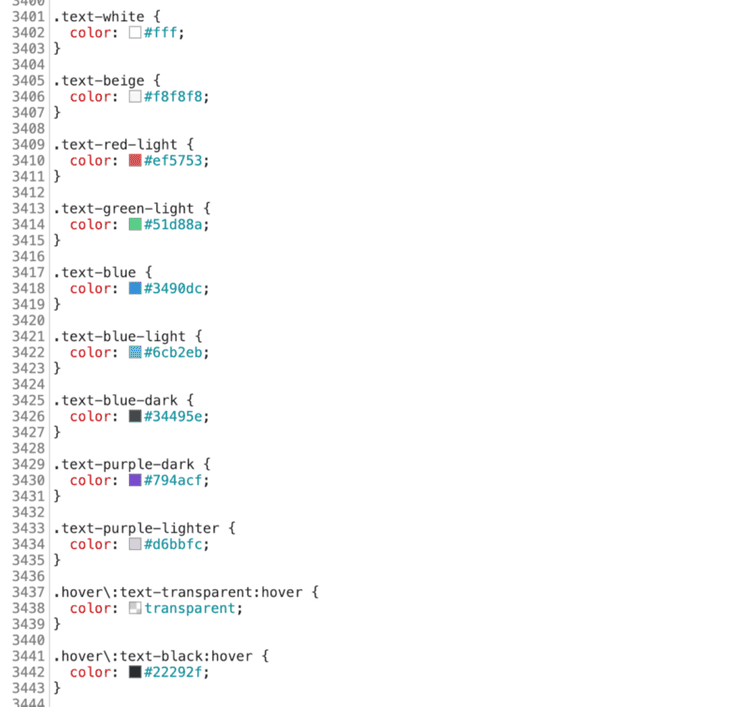
After that, tailwind utility will generate CSS utility classes like this:
A complete tutorial on how to configure tailwind for your design system will soon follow!
